If you’re thinking about brightening up your windows with a pop of colour, orange blinds can be a fantastic choice with 2026’s interior design trends.
Why choose Orange Blinds?
Why choose orange at all? It’s bold—yes—but in the right context it’s playful, uplifting and seriously stylish. Orange doesn’t have to be overwhelming; it can be used in more muted colour schemes to give a wonderfully cosy vibe.
Mood & personality
- Orange is known to evoke warmth, energy and optimism. It brings a sense of cheer to a room.
- Orange can be paired with earthy tones to create a cosy and warm feeling.
- If your space feels a bit neutral or safe, orange blinds can be the accent that gives it character.

Design impact
- Using a bright colour like orange on window treatments is a clever way to make your windows a design feature, rather than just a functional part of the room.
- Because blinds occupy a large visual area (the window), the colour you choose becomes part of the room’s palette.
Trending colour-accent
- Orange works well with Mid-Century design themes, or as a pop of interest for Scandi and Boho styles.
- While 2025 still sees a strong presence of neutrals, many trend reports point to vibrant hues (think terracotta, deep yellows, sunnier oranges) making a comeback for accents.
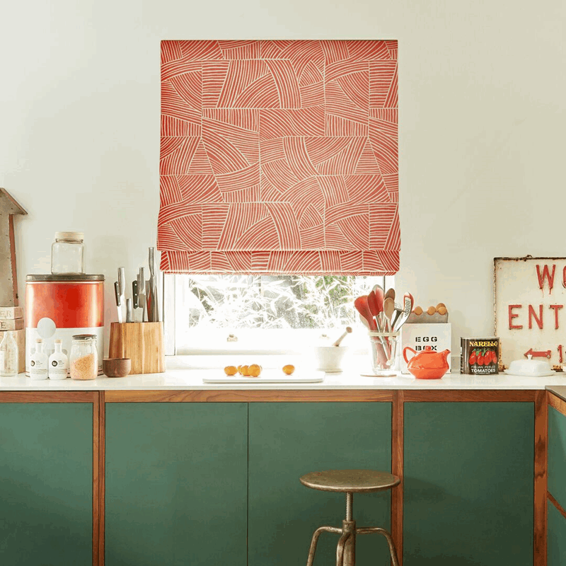
Patterned blinds with orange accents
If you’re looking for a more subtle use of orange, why not check out our range of patterned blinds fabrics?
- Contrasting background colours can make the orange pop even more. Consider blue or teal for maximum impact.
- Choose from traditional florals, bold retro or geometric prints.

Orange blinds with natural materials & textures
2025 design trends emphasise organic materials—wood, bamboo, woven fibres, natural textures in window blind looks.
How orange works: If you pick an orange blind fabric or finish that pairs with natural texture (e.g., a woven orange fabric or matte finish), you can combine bold colour and texture to stay on-trend.
Trend: Layering & versatility
Layered window treatments (e.g., blinds + curtains) are popular because they offer more flexibility in light control, privacy and aesthetics. Use the contrast of a bold pattern on one, and a more subtle plain fabric on the other for added interest.
What to look for when choosing orange blinds
Here are practical considerations to ensure your orange blinds look great and work well.
1. Shade & undertone
- “Orange” covers a wide spectrum of colours—from bright tangerine to muted terracotta.
- Think about your room’s lighting: direct sunlight might make a bright orange appear more intense.
- Consider undertones: a blueish-undertone orange will look different to a red/earthy orange.
- Try samples in your space at different times of day.
2. Material & finish
- For more texture: woven fabric, bamboo or natural wood blinds with an orange undertone.
- For a more modern feel: aluminium or smooth roller blinds with a matte finish.
3. Functionality
- Light control: Do you need blackout, room-darkening, or just filtering?
- Insulation/energy: Some blinds offer thermal linings, which help with heat/cold regulation.
- Smart features: Motorisation, cordless operation, remote or voice control.
- Child-safety: Cordless or chainless systems are safer if there are children.
4. Coordination with the rest of the room
- Orange will stand out, so check how it works with walls, flooring, furniture, and décor. This is easily done if you opt for an in-home appointment.
- If your room is very busy/patterned, you might choose a more subdued orange rather than super bright
- If you already have accent pieces (cushions, art, rugs) in complementary colours (greys, navy, forest green, natural wood) then orange blinds can tie in nicely. Look for existing pops of orange in patterned designs, and choose complementary or contrasting colours.